
I know so little about computer stuff, really, but I love to learn little things here and there. I've been loving blogs that have the portrait photos and the landscape photos all the same width - I feel like it's a clean look. So, over the last few weeks I've tried doing it a few different ways. Finally, I found one that I love and recommend.
First off, to manipulate your photo size, you can always head into your blogs HTML and play with it. Risky, but it can work. I was using a simple calculation to make all my photos the same width (600 px.), whether they were landscape or portrait. It works but it takes time to do it to each and every photo.
Then I found this code. It's easy to just copy and paste into your css, and it automatically adjusts all your blogs' photos for you without any further time sink. Awesome.
Here's where you can find it - on girl does geek .
So, I followed her directions, went to my blogger dashboard, then clicked on template, then scrolled down to customize, then add css .
A box will pop up, and then you just paste the code she provides into the box. On her site, the code has a bunch of spaces in it, but don't worry - when you paste it in, the spacing will be fine.
Also, once I pasted it in, and clicked apply to blog on the upper right of my screen, it took a little while. I thought it maybe didn't apply it or save it, especially when I looked at the post I was working on and saw the photos still their original sizes. BUT, when I previewed the post, I could see the pictures in the new adjusted size - an equal width in both portrait and landscape photos. In other words, the adjusted size will not show up on your draft, but when you preview or publish the post, the photos will be in the adjusted width!
I went back in and adjusted the css to suit my blog. The width provided in the code is 400 px, and my blog is larger than that. I just plugged in 600 px wherever the 400 was. Super easy, super fast, and all my photos from now on will automatically be resized to that width.
Yay for that!
So, want to see how it looks? Here we go -

Personally, I love it. I'm a super visual person, so silly little things like this bring me an absurd amount of joy!
**** - For some reason the CSS I used made all the images on my blog look pixelized. Until I can figure out why, I've reverted to just using the extra-large picture size. I'll update this if and when I figure out the CSS problem!
First off, to manipulate your photo size, you can always head into your blogs HTML and play with it. Risky, but it can work. I was using a simple calculation to make all my photos the same width (600 px.), whether they were landscape or portrait. It works but it takes time to do it to each and every photo.
Then I found this code. It's easy to just copy and paste into your css, and it automatically adjusts all your blogs' photos for you without any further time sink. Awesome.
Here's where you can find it - on girl does geek .
So, I followed her directions, went to my blogger dashboard, then clicked on template, then scrolled down to customize, then add css .
A box will pop up, and then you just paste the code she provides into the box. On her site, the code has a bunch of spaces in it, but don't worry - when you paste it in, the spacing will be fine.
Also, once I pasted it in, and clicked apply to blog on the upper right of my screen, it took a little while. I thought it maybe didn't apply it or save it, especially when I looked at the post I was working on and saw the photos still their original sizes. BUT, when I previewed the post, I could see the pictures in the new adjusted size - an equal width in both portrait and landscape photos. In other words, the adjusted size will not show up on your draft, but when you preview or publish the post, the photos will be in the adjusted width!
I went back in and adjusted the css to suit my blog. The width provided in the code is 400 px, and my blog is larger than that. I just plugged in 600 px wherever the 400 was. Super easy, super fast, and all my photos from now on will automatically be resized to that width.
Yay for that!
So, want to see how it looks? Here we go -

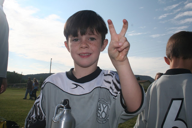
I added this portrait picture. Before I added the css code, at it's largest size it would have been narrow, about one inch narrower on either side than the picture below. Now, automatically, both pictures have the same width - 600 px.

Personally, I love it. I'm a super visual person, so silly little things like this bring me an absurd amount of joy!
**** - For some reason the CSS I used made all the images on my blog look pixelized. Until I can figure out why, I've reverted to just using the extra-large picture size. I'll update this if and when I figure out the CSS problem!
No comments:
Post a Comment